Creating responsive layouts with CSS can be a daunting task, especially when dealing with complex grid systems and positioning elements. However, with the rise of CSS Flexbox, developers now have a powerful tool at their disposal to create flexible and responsive layouts with ease. And thanks to the CSS Flexbox Generator, building these layouts has become even more intuitive and user-friendly.
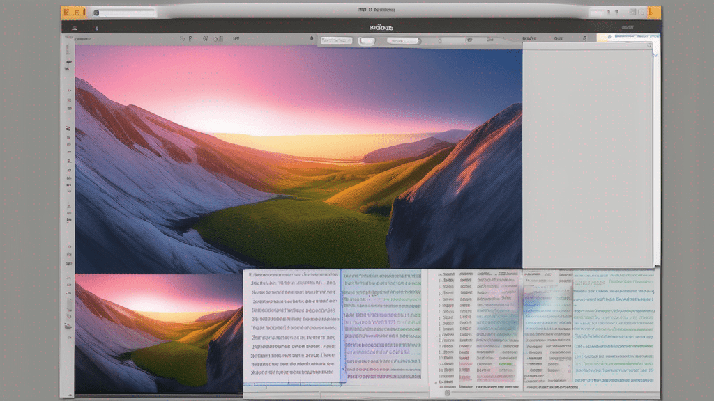
The CSS Flexbox Generator is a web-based tool that allows you to visually construct and customize Flexbox layouts without having to write a single line of code. It provides a drag-and-drop interface where you can add, resize, and position elements within a Flexbox container, all while seeing the changes in real-time. This visual approach not only streamlines the development process but also makes it easier for beginners to grasp the concepts of Flexbox.
Key Features of the CSS Flexbox Generator
The CSS Flexbox Generator is packed with features that make it a versatile and powerful tool for building responsive layouts:
Intuitive Visual Interface
The tool’s visual interface is designed to be user-friendly and intuitive. You can easily add, remove, and rearrange elements within the Flexbox container, and see the changes reflected instantly. This real-time feedback makes it easier to experiment and fine-tune your layouts.
Customizable Properties
The CSS Flexbox Generator allows you to customize various Flexbox properties, such as flex-direction, justify-content, align-items, and more. You can adjust these properties using sliders or dropdown menus, giving you complete control over the layout’s appearance and behavior.
Responsive Preview
One of the standout features of the CSS Flexbox Generator is its ability to preview your layouts across different screen sizes. With a single click, you can see how your Flexbox layout will adapt to various devices, ensuring that your design is truly responsive.
Benefits of Using the CSS Flexbox Generator
Using the CSS Flexbox Generator offers several benefits, including:
- Faster development: By eliminating the need to write code manually, you can build responsive layouts much faster.
- Easier learning curve: The visual interface makes it easier to understand and apply Flexbox concepts, especially for beginners.
- Increased productivity: With real-time previews and customization options, you can iterate and refine your layouts more efficiently.
- Cross-browser compatibility: The generated CSS code is optimized for cross-browser compatibility, ensuring your layouts look consistent across different browsers.
Getting Started with the CSS Flexbox Generator
Using the CSS Flexbox Generator is straightforward. Simply visit the tool’s website, and you’ll be greeted with a visual interface where you can start building your Flexbox layouts. The interface is divided into two main sections: the canvas area, where you can add and manipulate elements, and the property panel, where you can adjust various Flexbox properties.
To get started, you can either create a new layout from scratch or load one of the pre-built examples. Once you’ve set up your layout, you can customize it by adjusting the properties in the panel or by interacting with the elements directly on the canvas.
When you’re satisfied with your layout, you can copy the generated CSS code and paste it into your project’s stylesheet, or you can export the code as a CSS file for easy integration.
Conclusion
The CSS Flexbox Generator is a powerful and user-friendly tool that simplifies the process of building responsive layouts with Flexbox. Whether you’re a seasoned developer or a beginner learning CSS, this tool can help you create beautiful and flexible layouts with ease. So why not give it a try and experience the power of visual Flexbox development? Visit the CSS Flexbox Generator today and start building your dream layouts visually!